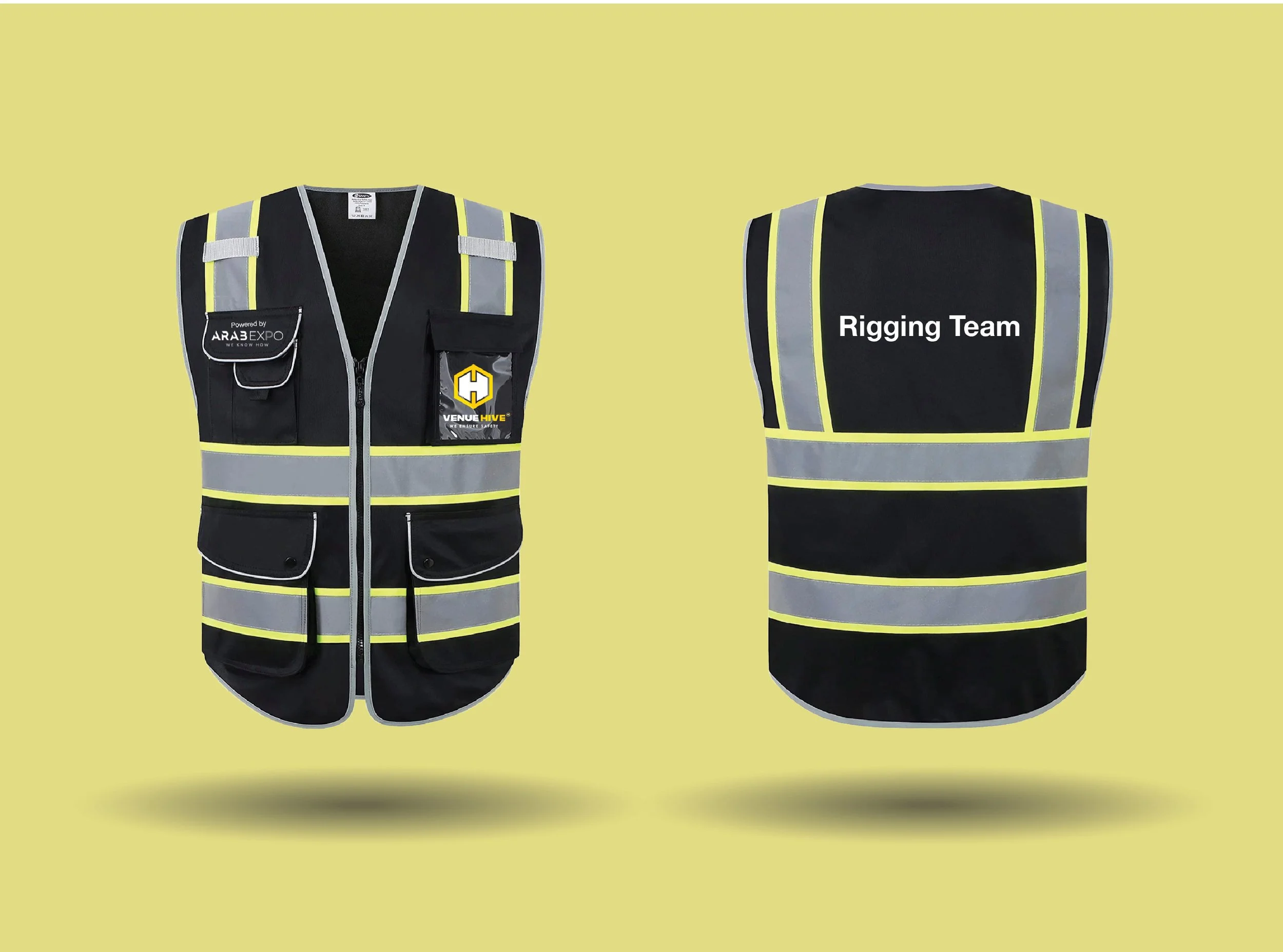
Venu Hive
Brand Identity
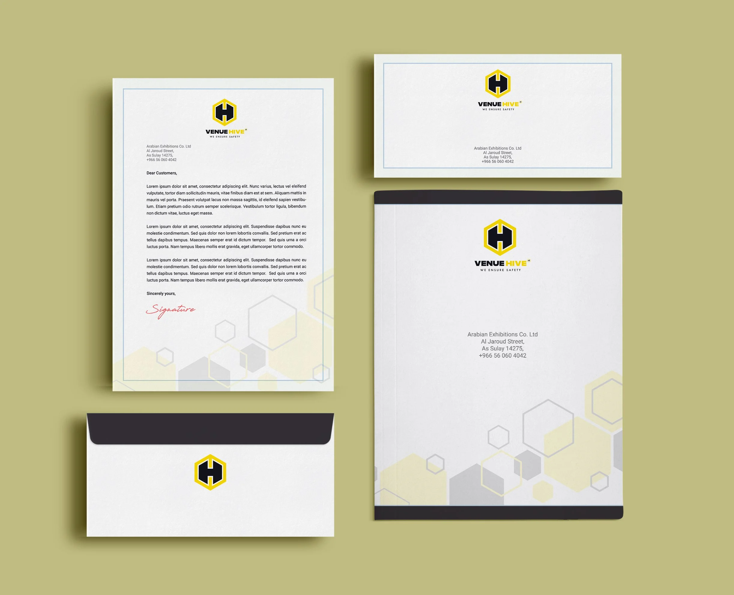
We worked with Venue Hive, an event execution company, to develop branded assets and visual communication materials across their event planning and operations. Our responsibilities included designing marketing collateral, presentation templates, and client-facing materials that conveyed Venue Hive’s identity in a clear, professional, and consistent way.
We also supported the production of event-specific graphics and documentation, ensuring that each deliverable aligned with the company’s standards while remaining adaptable for different venues, partners, and project types.
BRANDING AND IDENTITY
LOGO DESIGN
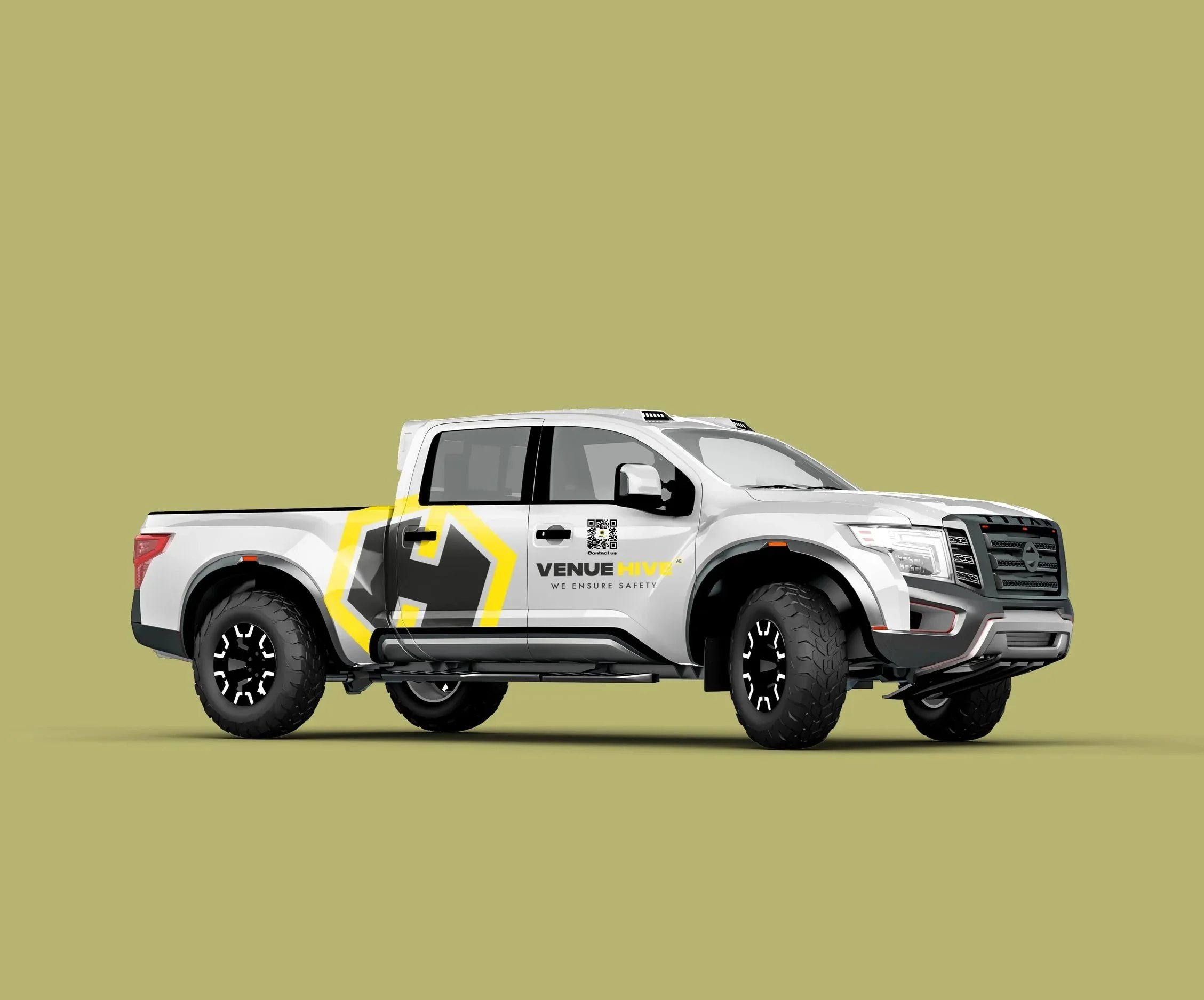
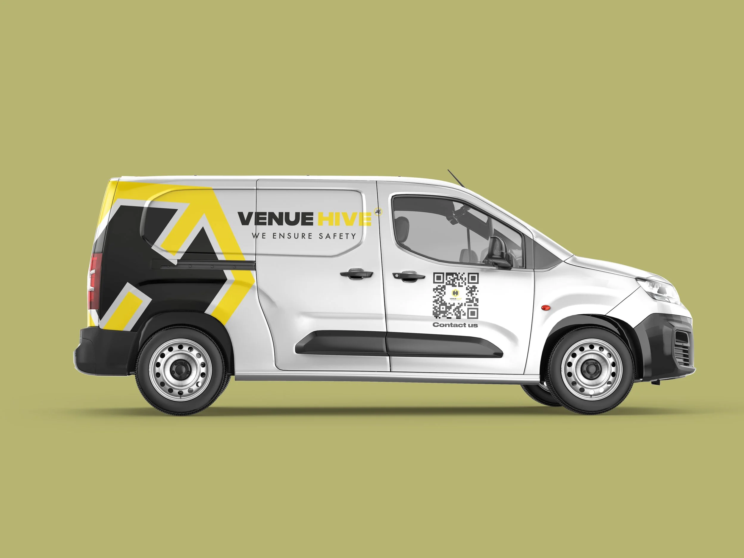
MOCK UPS
PRINT READY FILES
Year
November - February 2024
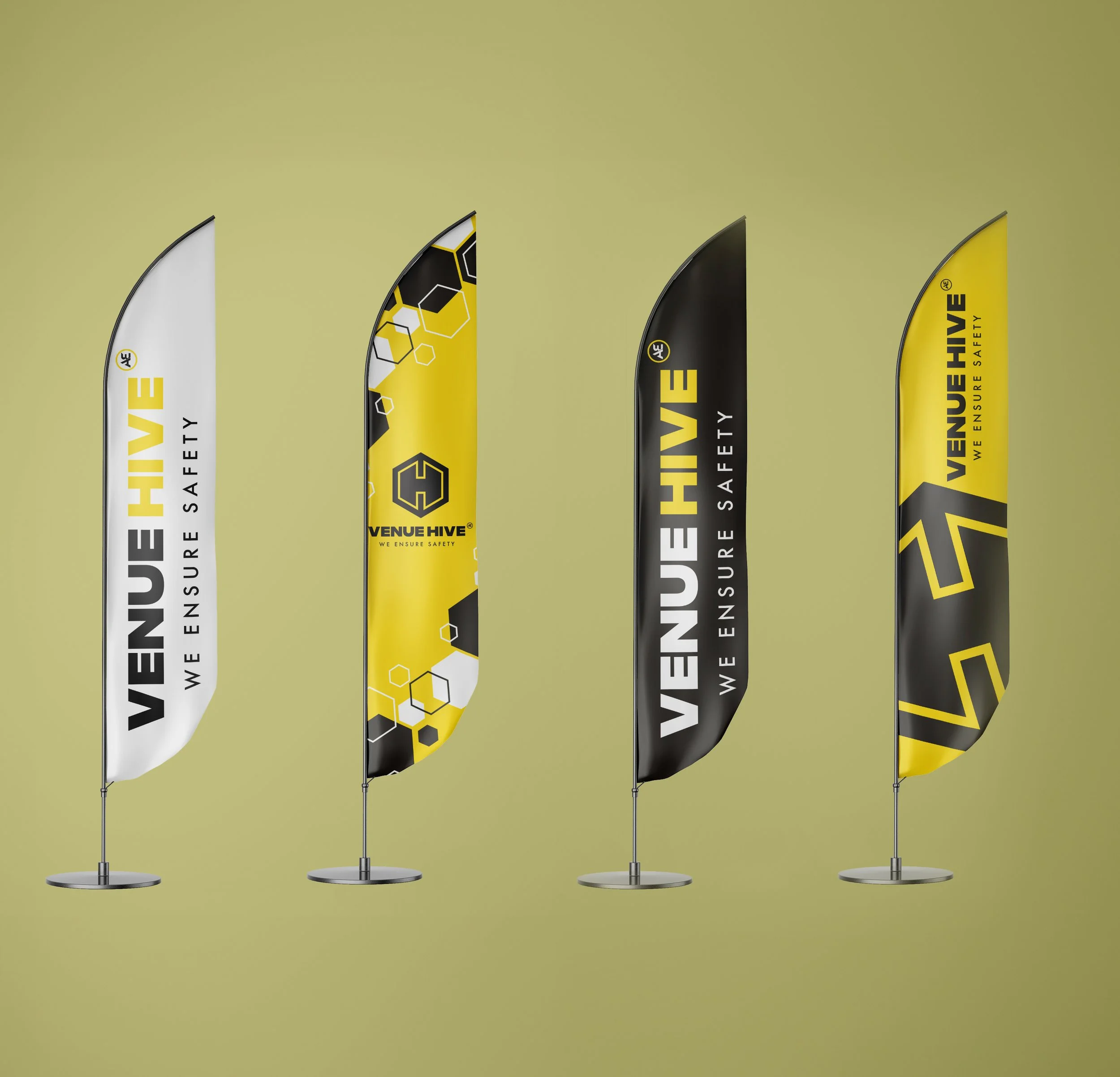
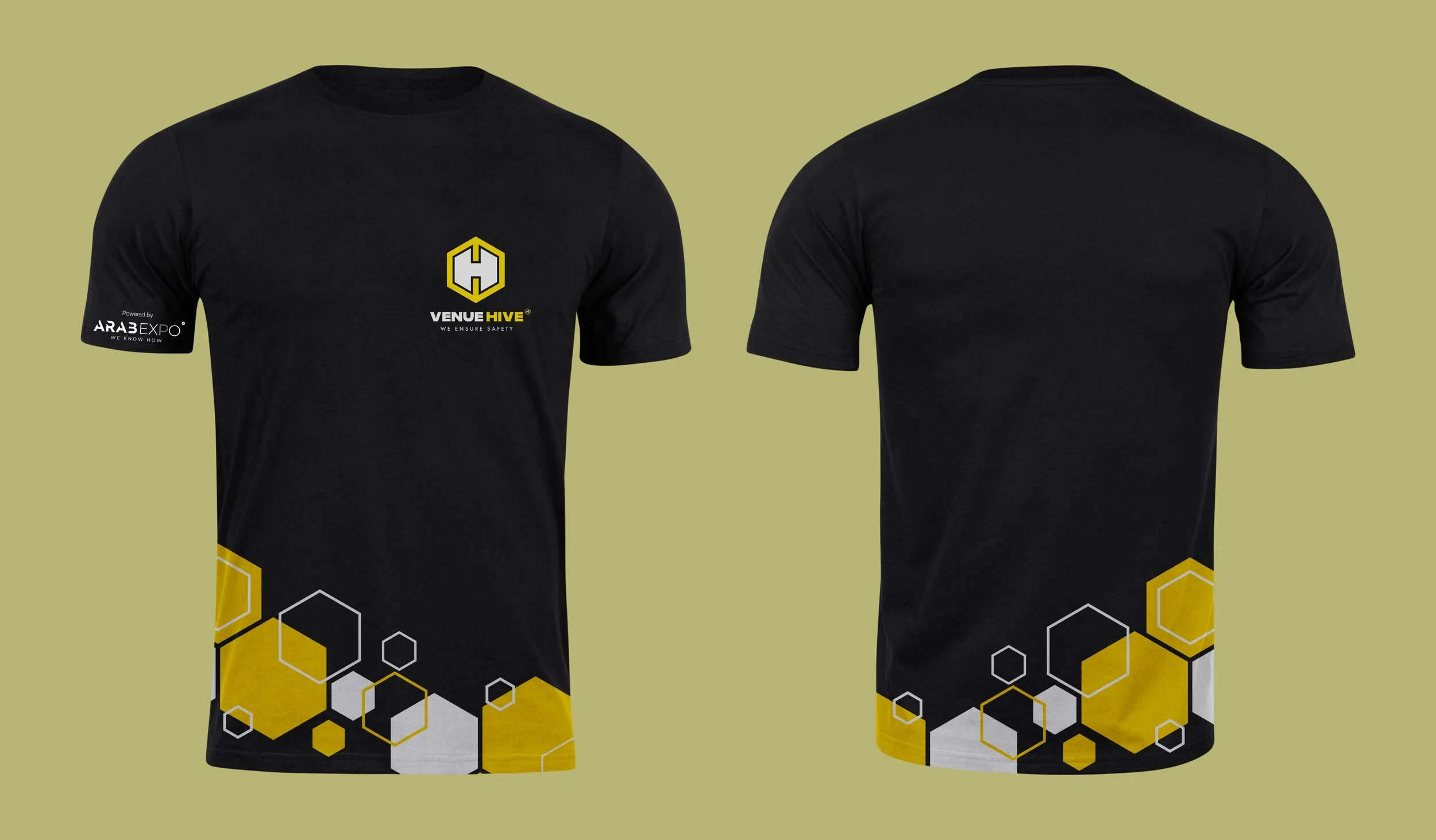
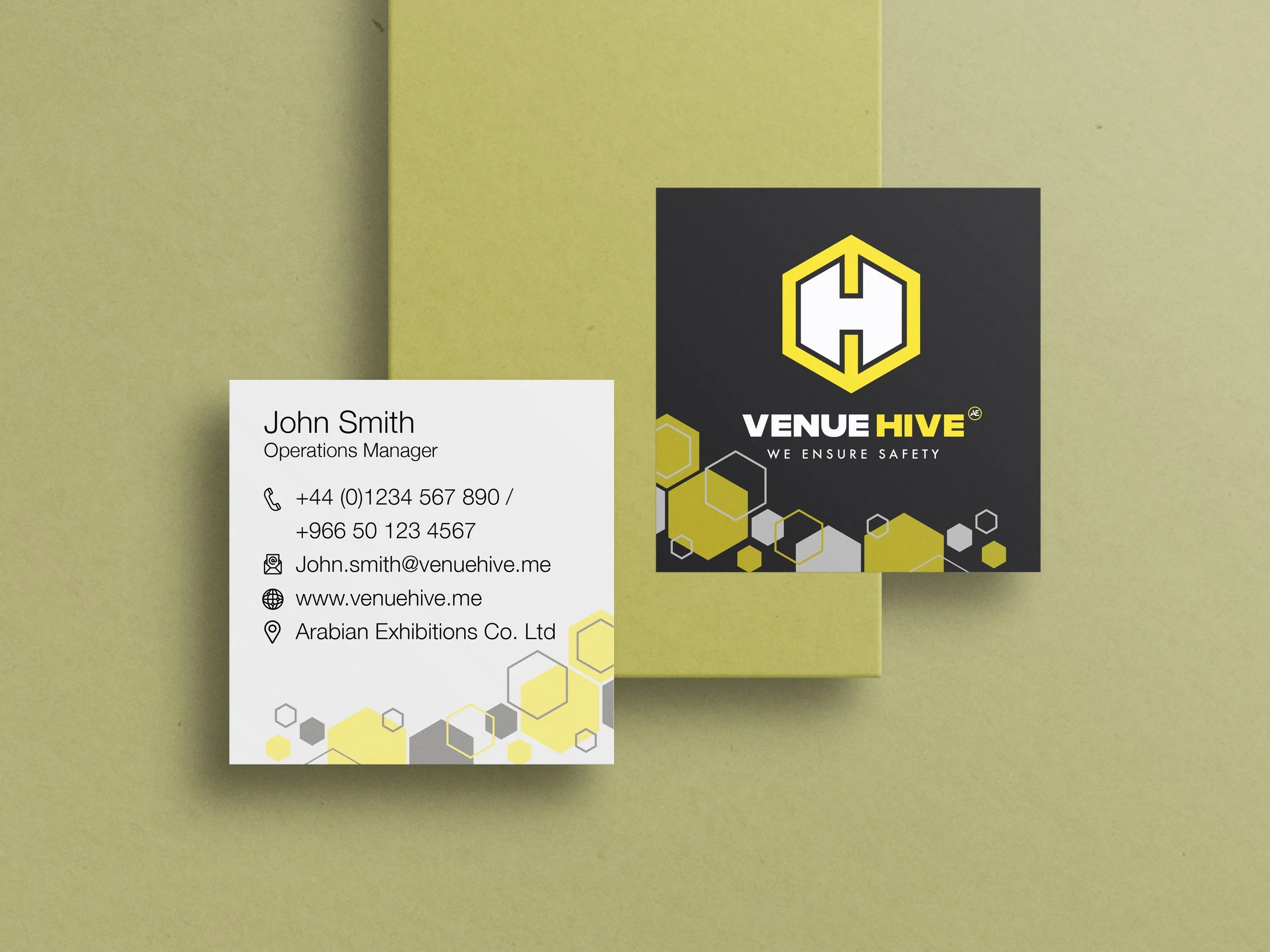
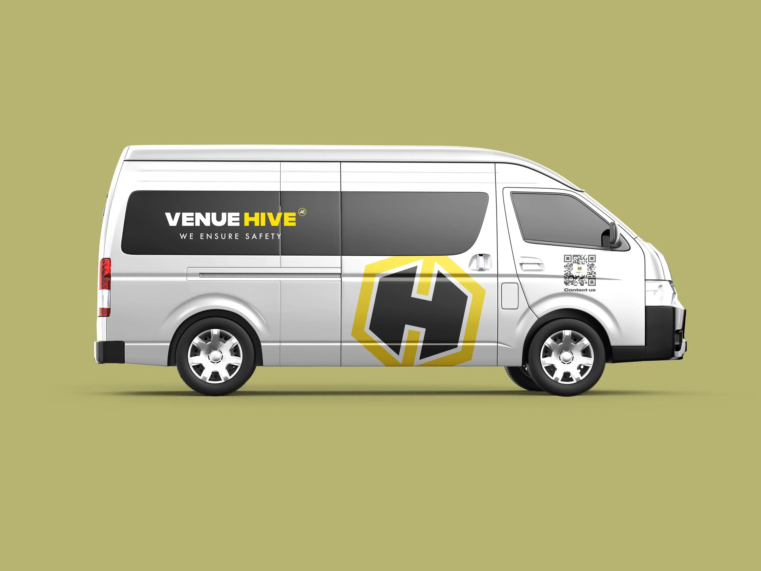
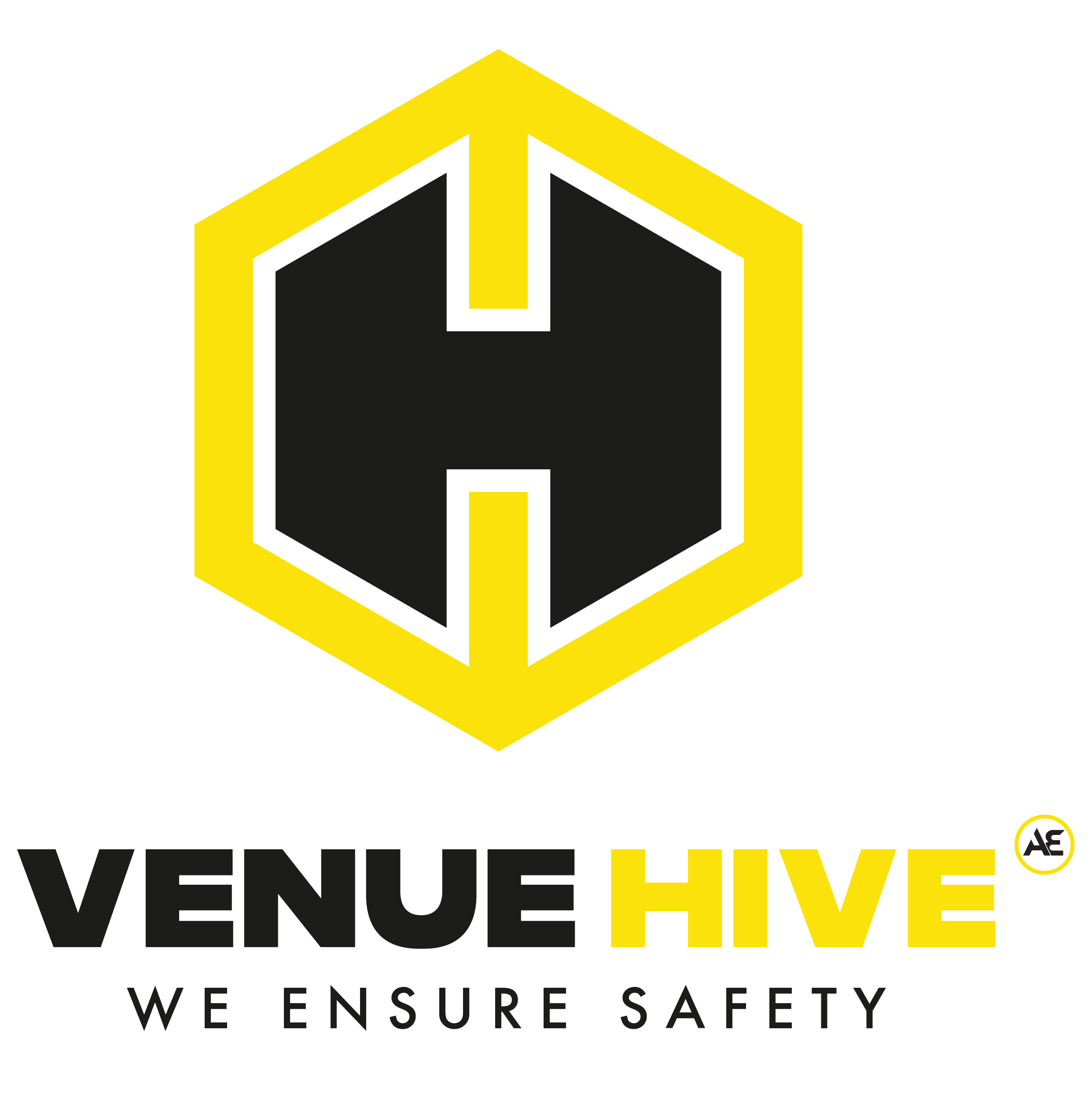
The Venue Hive logo combines bold geometry with high-visibility color to communicate safety, structure, and reliability. The primary mark features a hexagon outline in bright yellow, a deliberate reference to a beehive cell, symbolizing collaboration, systematic organization, and efficiency. Inside the hexagon, a strong black “H” is constructed using sharp angular forms, creating a sense of stability and protection. The typography is a heavy and wide sans-serif typeface that depicts the strength, dynamism and vigor of the brand.
